Sunday, 2 June 2013

Exam - MAIN PIECE


This is my finished piece. As you can see I mounted all my individual images onto a large board. Before mounting the finished images though, I spray-painted the gender symbol for women repeatedly over the board. I chose 3 colours for this; red, gold and pink. The red is supposed to create another link to Barbara Kruger's work, the gold is to showcase the importance of feminism and the pink to relate back to the individual images and their message of stereotypes. 

Personally I think the collage worked well as the ripping effect created more interesting pieces and also linked back to my original Geisha Project. As you can see I also included some other items into my finalised piece.

I added a fire extinguisher at the end of my board and attached it to a washing line that ran across my work. I then painted 'The Sun''s logo on top of it. As you can see I also hung bras from my washing line. This was all meant to represent the standstill in feminism. Although feminism has already achieved so much for women, people still seem to consider it a 'dirty word' or people think women are already equal in society. Sadly, this is not the case. Therefore the bras represent the success of the feminist movement so far and how their campaigns such as 'burning bras' have led to a much better society. However limitations still occur and a lot of that is down to today's media.

'The Sun' is just one example of how the portrayal of women in society is extinguishing the flame that feminism has tried so hard to establish. The washing line shows how it is time to forget the old connotations of feminism, dust off your bras and start the flame again. Futhermore, both the bras hung are detailed. On the first I have done a biro drawing of Leonardo Da Vinci's fetus study and on the second, I have stitched the ends of ties together to form half the bra. This is to show that whether you want to stay at home and be a full-time Mum or be a high-flying career woman or maybe just a bit of both you can still be a feminist.

If I were to do this project again I would perhaps work on the refining my painting on the individuals pieces as I felt my  Geisha portraits were much more sophisticated.

Exam - MAIN PIECE


Although I felt my plan established what I wanted from my final piece, there were many changes I made throughout my exam.For example I didn't just focus on the influence of 'The Sun' when considering the impact of today's media on gender roles - I also looked into magazines such as FHM and Good Housekeeping to show the varied portrayals of women in the media. Furthermore I felt that my images had to be linked to create an overall piece, rather than 3 individual ones as all areas are reliable for the how women are portrayed in society. However I will evaluate my completed piece in my next post and now, just focus primarily on the individual images.

On the left is an image of my Mum and I have included collage from a 'Good Housekeeping' magazine. Upon reading this magazine you can see how heavily targeted it is at women. Although 'Good Housekeeping' never objectifies females, it still shows how women are still regarded as in charge of the house-work and responsible for the 'home'.

The middle image is a picture of a man and I have included collage from a 'FHM' magazine. I chose this as the images chosen and comments made are targeted, almost solely, towards males. Whilst searching for images I saw comments on how much 'easier' girls were on holiday and other derogatory comments yet it is an increasingly popular magazine with a wide readership.Therefore this piece shows how the media portrays women specifically to men.

The third image is picture of myself with collage of 'The Sun' newspaper. I decided to use 'The Sun' for my image as personally, I find it the worse. 'Good Housekeeping', whilst showing females in a more traditional way, never objectifies them and although I don't like FHM, female magazines also objectify men in some areas such as heat's 'torso of the week'. However 'The Sun' is a newspaper and nudity shouldn't need to be next to a tragic news story or a momentous event.Although I used Page 3 in my collage I also used other articles out of the paper. The background is also a repeated cutting of Page 3 laid out to form a 'brick wall' template to show how, sometimes, the overexposure to nudity can lead to the foundations of a girls insecurities.


Exam - MAIN PIECE

To incorporate all that I had explored throughout the last two years I felt it was important to start with a plan. I wanted to make sure I included things that had inspired me, mediums I felt best showed off my skill and finally, messages that were important to me.

Therefore I decided that I would: 

- use my own photographs as they would be able to portray my ideas much clearer than images from the media
- to paint in acrylic as I felt my identity project showed that my strong point didn't lie in oil painting
- to include other mediums such as collage because I enjoyed using it in my Geisha project and felt it would increase the level of fluency in my work
- to paint using only black and white tones to relate back to my exploration into art history, in particular Barbara Kruger
- to include the Sun Logo somewhere in my piece as a comment on today's media
and finally...
- to show how feminism is growing and has already improved the lives of many as the Guerrilla Girls showed me 

Exam


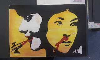
This was another piece I did during the preparation stage of my exam. Although it is a much simpler piece and perhaps, doesn't include the skill of an oil painting or fully-coloured painting I felt it worked best for the message I wanted to portray. The black and white image with the subtly of red hints at the connection to Barbara Kruger. However I did think it lacked some of the skill I was so keen to develop throughout my personal study. Therefore, for my main piece, I thought it would be better if I included some other mediums too, that had worked well for me before - such as, collage.

Exam


Although I was keen to use the imagery of 'The Sun' as a big component in my main piece I was reluctant to use 'Page 3' as I felt I wanted to focus more on the fact that the newspaper thinks it is acceptable to showcase nudity daily rather than point focus at the models themselves. Therefore I decided the logo was the best image to use to represent my question into today's media. This is a piece of prep that I used to experiment with use of the logo. This was also to link my previous projects together to make sure that I had an element of fluency in my work. I used a varied palette on the face to link to my identity project, the medium I used was palette knife painting to relate to my personal study development and finally collage to link my original Geisha project. Although I was happy with the piece overall, I didn't think it related back enough to the work I had done for my prep.

Exam

This was a further exploration into Barbara Kruger's work using my own photos. As I still wanted to continue my study of The Sun's influence on today's female, especially young ones, I made it the central topic of my first poster. I kept the logo in the picture rather than just copy it up in the same font as I thought it portrayed the message clearer - it was also a similar style so the aesthetics of the overall composition weren't compromised.The slogan 'The Sun casts a shadow' is something I made up when doing my Edvard Munch copy. I think it highlights the issue well.In the picture I also tried to make the model seem as young as possible by having their hair in bunches and them dressed in their primary school jumper. Once again, this just reinforces the pressure girls feel when they are so overly-exposed to the unrealistic portrayal of the supposed 'perfect body' at a young age and to highlight how innocent some individuals are. The middle poster is entitled 'Worker, Wife, Mother, Equal?' and is actually a picture of my own Mum. The many stories of her struggle against sexism in the work place was a further inspiration for this project. Finally the last poster states 'Feminism suits anyone'. Although the actual phrase lacks the wit of Barbara Kruger, I felt it was important to establish that some men are proud feminists and that more should be.


Exam


After looking into other art history and doing an in-depth study on the 'Guerrilla Girls', I felt I should focus on my other main inspiration as well; Barbara Kruger - her black and white images with thought-provoking red statements are some of the most iconic pieces in modern art. Therefore, similarly to my adaption of Andy Warhol's piece and Edvard Munch's, I decided to modernise their approach to fit with my own personal experiences. Here I used the same layout as Barbara Kruger and with some of the same slogans however I chose an image out of The Sun as the main focus. This was to show how, although I don't agree with a newspaper so openly showing a naked woman, I also don't harness any disrespect for the models and so don't feel they should be stereotyped as they often are. 

Exam


To further my understanding of feminism in art I looked into more examples of art history. Although I think this is a powerful image, I, personally, felt the design was too simple.

Exam


To increase the fluency of my art work I decided to incorporate some of the skills I had learnt from previous projects into some of my prep. Here I use oil paints to do a direct copy of 'Puberty' by Edvard Munch. My exploration of him in my personal study prompted me to use him as he did very emotional nude paintings/drawings. This particular image is one I am very interested in, not only because it is such a powerful image but because there is strong debate on what the shadow represents. One argument is that is represents 'looming male genitalia'  and  the thought of male genitalia to a young woman during this time of her own rapidly changing body creates a stench of tension within the piece. Although I thought this was a very interesting outlook I decided to modernise my approach. For example I looked into the influence of today's media on young women in particular, the Sun. The shadow cast is a collage of the Sun's Page 3 as I feel the constant imagery of the 'perfect woman' in today's media is repressive and can lead to many insecurities
However I also included the Gorilla head as it shows how my challenge to these images and my attitude towards feminism protects me from the shallowness of today's media.

Saturday, 1 June 2013

Exam


These pieces were to further my exploration of the 'Guerrilla Girls' and the importance of their movement. I picked recognised paintings by famous male artists and modified them to include the head of a Gorilla. I did this by, first drawing the Gorilla and then photocopying it onto the image. 
Theses was my own versions of the 'Guerrilla Girls' campaign - 'Do Women STILL Have to be Naked to Get Into the Met. Museum?' where they placed gorilla masks on top of famous nude paintings. 

However I didn't just decide to pick pictures of nude women, I also looked into one version of Andy Warhol's piece 'Marilyn Diptych'. Warhol repeatedly commented on society's infatuation with fame and celebrities in his works. This analysis of the media and the impact it had on women was something I felt was important to display. 


I added gold frames to both these pieces as gold has connotations of prestige and excellence; something I believe the Guerrilla Girls have achieved and I personally wanted to celebrate that. However the frame was also added to indicate the urgency of increasing women's representation in galleries and the art world. Each gender deserves equal representation however in the Metropolitan Museum of Art in New York, as shown by the Guerrilla Girls 2012 poster, less than 5% of the artists in the Modern Art Section are women but 85% of the nudes are female.

Exam


These are some of my explorations into the representation of men and women in today's media. Whereas men are plastered on page after page of the sports sections, women get recognition for photo-shoots in bikinis. Although I fully respect models, I don't believe that this counts as news. 
In both these instances I used brusho to create a second layer to the picture to question this portrayal.

Exam - Inspiration


Throughout my A-Level course, it had always been important that my pieces portrayed some sort of message therefore for my exam I wanted to keep that apparent. Furthermore I wanted to use personal experiences to shape my art and thus picked a topic close to my heart - feminism. Although I'm only a teenager I feel I have been subjected to many misogynistic and sexist situations and at the time felt I couldn't voice my protest. Looking into artists such as Barbara Kruger and movements like the 'Guerrilla Girls' only fueled my desire and so, my exam project was decided.
A further inspiration was my trip to Liverpool and a visit to the Tate Modern. Sylvia Sleigh was being exhibited and was famous for her nude paintings of males. Known to be a feminist herself, her work inspired me as it was so strongly connected to the Guerrilla Girls and their beliefs. For example, the Guerrilla Girls campaign for recognition of women in art and use the comparison of nude paintings of women vs. paintings by women in galleries as an argument. Similarly Sylvia Sleigh painted men nude as it went against the stereotype of that time. This area of inspiration led me onto to look at the use of nudity into today's art and also, today's media.  

Further exploration into landscapes...


These two pieces were done in between projects and were predominantly due to my personal study and my love of Van Gogh's work. The one on the top left is just a direct copy of 'Wheatfield with crows' using oil paints. Although I like this piece if I were to do it again I was use a higher variety of tones within the wheat field and also make a more atmospheric sky as this is a key element to Van Gogh's work.                                

 The one on the bottom right though was done by using a technique I learnt on a course called 'felt-making'. Although the overall process was fun, I felt the vividness of the colours used by Van Gogh was lost. I preferred the piece before it was flattened down and soaked to create felt (shown in the top right corner) as it still retained the vivid use of colour and also created the atmospheric sky that the oil painting lacked. However the variation of tones within the wheat field lacked again.

Identity Project (+ explorations into landscapes)


 On the left was my next attempt at oil painting. As I still wanted to base my project on Identity, I decided to do a more in-depth study into the personality of my model. She loved geography and was keen on preservation therefore I thought a study of landscapes would help create the perfect palette for my piece. On the right are some examples of my development. Throughout this stage I was keen to experiment with a range of mediums, such as palette knifing, brusho and collage, as my personal study prompted me to increase my skill base. These pieces all helped me decide that I should predominantly use greens, yellows and browns as my main colours however the top painting of cherry blossom made me also use pink as I believe cherry blossom capture a certain beauty, a similar emotion my friend has to the entirety of nature. This emotion was one I wanted to preserve, just as my friend wants to preserve the beauty of the environment. Overall I was happy with my final piece however I think an increase in different tones would have produced a better outcome as definition on the face would have been clearer.

After I wrote this post, I decided to add trees into the background as I felt it gave a stronger connection to the identity of the model.

Identity Project


To develop my oil painting skill further I also did some direct copies of my own photos with no varied colour schemes or extra images. Although I liked some areas of this piece, such as the hair, overall I felt it lacked any real depth and once again, the eyes didn't seem realistic. Therefore I decided to try and incorporate both of my previous explorations into identity (the images within the ink drawings and the previous oil painting) into one piece.

Thursday, 30 May 2013

Identity Project


Although I enjoyed my previous brusho project, my personal study prompted me to develop my skill in oil painting and to move away from such abstract pieces. However I still wanted to keep some of my original concept, just increase the subtlety of it. Therefore I chose the same image as before and although I didn't copy the symbols of my brusho piece into this, I kept the presence of yellow. I was happy with piece as I felt I was able to create realistic shading on the face through prominent brushstrokes and a varied palette - I used a range of browns, yellows and blues. However my inexperience meant the eyes lacked realism due to bright white creating an overwhelming contrast between the eyes and the rest of the image. 

Identity Project


As I enjoyed the process of my last piece, I decided to try it again using an image of my friend. For her symbols I decided to focus on her interests as she is an incredibly passionate person and her hobbies influence her a lot. For example her love of music is a very important aspect of her life; she attends gigs regularly, plays the guitar and keyboard and hopes to become involved in music in some way in her later life. Her other love is America. She has visited New York and hopes one day to live in California. Furthermore she is doing 'American Politics' at university. To highlight these aspects, I used a music note to create the shape of her eye and shading on her face, this symbolises her vision of working in the music business. In addition, I used the American colours throughout her face however her central features are predominantly red to reference the central redness of the United Kingdom flag and how, although America may be her ultimate passion, she is equally as proud of her British roots. 

Identity Project


Using my passport picture as a template, I designed this brusho piece. Although it is far from photo-realistic, I felt the incorporated symbols portrayed a more realistic image of me than the original photo. The predominant colour of yellow has connotations of happiness, something I believe is a key aspect of my life due to friends and family. Yellow also connotes a sense of positive thinking, which I try to maintain however the main features of the face are a much duller colour due to the insecurities I feel towards some aspects of my appearance. Overall though I tried to showcase the positives in my life; my features include Japanese lettering spelling out 'Ellie' as a symbol of how lucky I have been to experienced such travels and I gave myself a more animalistic nose to show my protectiveness towards my friends and family. Furthermore it links back to my question on identity as it relates to my date of birth as my star sign is a Leo and the overall image I've produced looks slightly feline. 

Identity Project - Inspiration


Whilst re-searching my last project I looked through my souvenirs and belongings from Japan. This led me to my passport, it struck me as weird that one document could showcase your entire identity and allow you to travel and buy alcohol among many other uses. Ultimately this was the beginning of my next project as I began to question what 'identity' really was - is it your date of birth and gender? Or is it your experiences, family and interests that make up your identity. In the end, I couldn't decide however I thought that it would be interesting to explore in my next topic. I used my passport image as a starting point.

Monday, 20 May 2013

Geisha Project - Main Piece


This was my main piece for the Geisha project and also was the one I chose to enter into the Gallery Exhibition. I was very proud of this piece as it seemed to solve all the problems I have previously encountered with my prep. During the project I had experimented with collage and how it was able to portray certain messages and meaning. 

In this piece the collage included:
- coloured paper to create an interesting background and provide contrast to the whiteness of the paper extracts and the painted faces of the Geisha's.
- extracts from the book 'Memoirs of a Geisha' to reference the personal experience of Geisha's and their historical importance in Japan. 
- photocopies of brochures from Kyoto that I brought back from my trip there in Summer. These were to link back to my initial inspiration for this piece whilst also showing how Kyoto and the Geisha are fading into more of a tourist attraction rather than a current tradition

From my prep, I decided that paint would be the best medium to use over my collage as it provided the detail of the biro and felt pens, whilst also maintaining some of the fluency of brusho. Using my own photos, I decided to only use a limited palette for the faces as the make-up of a Geisha is often referred to as 'her mask'. Therefore, although, I didn't achieve perfect photo-realism I feel that the faces portrayed a that mask-like feeling.

Finally I included a few other images alongside my faces. 
- The Japanese writing at the bottom of the piece says 'Iconography' to link back to my prep and re-search into the changing icons of Japan. 
- The red circle on the left is referencing the Japanese flag as I felt it was necessary to
establish which country this was relevant to. A lot of people I first talked to believed
Geisha were originally a Chinese idea. 
- The other red, slightly more detailed circle, at the top right of the piece is a link to
some Japanese art: in particular, Hokusai and his "Amida Waterfall on the Kiso Road"
scene. 

Sunday, 19 May 2013

Geisha Project


Although I loved brusho I felt for this topic collage allowed me to put across a message more effectively. Firstly I took some pictures of myself (as seen as the top of this picture) in traditional Geisha dress. I decided these would be best to use in my main piece as secondary images wouldn't allow me to reference my personal journey to Japan and my feelings toward to rapid decrease in the Geisha culture. The ripped coloured background, whilst first be focused as aesthetically pleasing, can show how colourful and varied the life of the Geisha is. Whilst describing my topic to people, they labelled Geisha as 'prostitutes', something that  no doubt is offence to rich Japanese tradition. The varied opinions of Geisha's was again something I wanted to develop.

The biro drawing allowed for a simplistic design that didn't clash with the bright background. It also was able to remain subtle, something I thought worked well. 

Geisha Project


Instead of trying to establish a message in this piece, I focused on use of other materials. I enjoyed using brusho as it allowed me to portray a more fluid piece as the water-based medium was great for movement and also for varying shades. However for my main piece, I don't think I would use brusho as it is quite difficult to achieve detail and precision, although I would like to use it later in the year.

Geisha Project


For this piece I wanted to compare iconography in Japan again however this time I decided to achieve the detail that lacked in my previous piece, it was best to have collage as a base instead of incorporating it into the main image. Therefore I decided to draw the Geisha as cartoons as a reference to the massive culture of anime and cartoon drawings in Japan.

I drew this on top of ripped up, coffee stained extracts out of the book 'Memoirs of a Geisha'. I read this book as I began re-searching my topic and it gave me a much better understanding of Geisha culture and the history of it. I coffee-stained them to show how the Geisha community is in serious decline and instead of being one of Japan's current icons, it is instead a fading tradition.

Geisha Project


I decided to focus on the development on Japan as a country and the contrasts I saw whilst there. Although I went to places that were rich in tradition, it was clear to see how technologically advanced Japan is in comparison to England. However it was the contrast between the changing icons of Japan that interested me the most. Whilst visiting Nagoya, images of cartoons and anime such as Hello Kitty and Astroboy were overwhelming however I also visited Kyoto, the birthplace of the Geisha. Seeing impressive temples and some Geisha themselves really gave me a sense of tradition.

In this piece I experimented with collage to combine these two iconic images of Japan. The 'Hello Kitty' symbol allowed me to keep the whiteness of the Geisha's face whilst also ensure the redness of the lips was shown. Whilst I loved the message this sent, the execution lacked the detail I wanted to achieve in my main piece.

Geisha Project


This is one of my sketches from my life-drawing classes. I tried to keep it a simple line drawing without much shading/detail as I wanted it to have a more cartoon style feel. This was to incorporate it into my theme. Although I found it difficult to stylise whilst drawing from direct observation, I feel I achieved a simplified look whilst also maintaining the correct proportions. To link my study to my theme further, I altered the cloth he was sat on to resemble a sumo belt to relate back to the historical aspect of my project. 

Geisha Project - Some of the sights in Japan


Inspiration


In July - August 2012 I got the amazing opportunity to go to Japan with 5 other people my age from across the globe to counsel 40 children in areas such as poverty, peace, stereotypes and prejudice. Not only did I make loads of new friends and have a great time, I also got to experience a new culture. Whether this was through trying new foods, struggling in the humid weather or, in particular, looking into Japanese art and architecture, it was very enriching. It also provided the bases of my personal study and my first official project of A2 art.